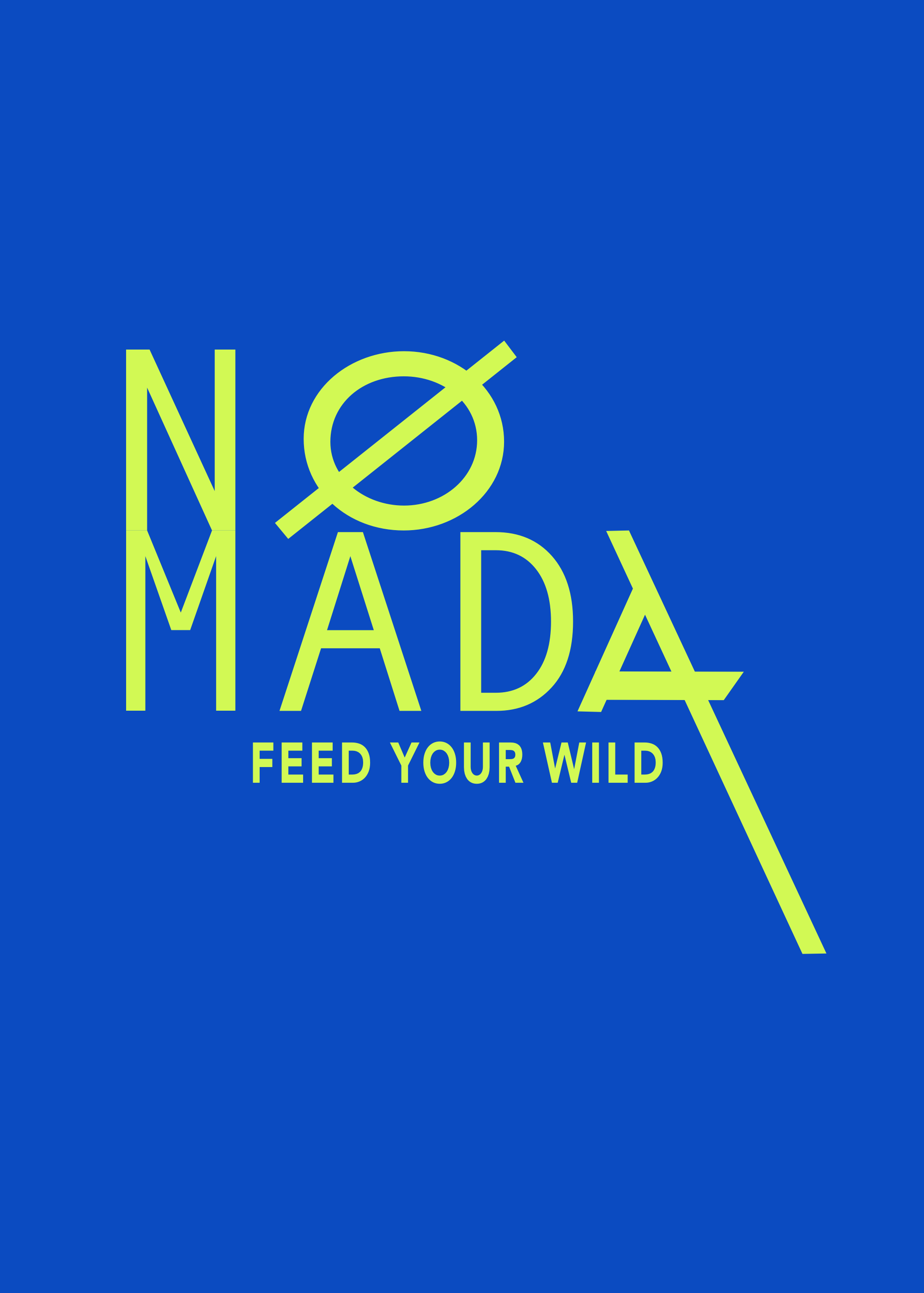


Nómada means nomad in spanish.
noun.
a member of a people or tribe that has no permanent abode but moves about from place to place, usually seasonally and often following a traditional route or circuit according to the state of the pasturage or food supply.
Nómada is an interactive travel journal application where travelers can create travel experiences and share with fellow travelers within the app.
THE PROBLEM:
Travel magazines are beautiful and informative, but they lack a personal connection with the reader. Services like Yelp and Trip Advisor are also helpful for planning trips but they lack customization and a sense of community among its users.
THE SOLUTION:
What makes Nómada so different from the other apps is that it’s an intimate, first-hand experience from your ‘average traveler’. A curated travel journal with unique travel experiences written by users, also known as Nomads, and shared within the Nómada community. Travelers can avoid ‘tourist traps’ and expensive, over-rated hotels to experience authentic travel experiences.
IMPACT & RESULTS:
-create a logo and brand identity that truly captures the spirit of authentic travel experiences.
-design a website that explains Nómada’s purpose and opportunities to download the app
-design a native app that allows users to publish and share their travel experiences within the Nómada community
-create a digital travel magazine that showcases the most voted travel experiences within the Nómada community
I wanted to capture the essence of ancient hieroglyphics and primitive markings. I was inspired by the patterns and shapes found in African textile prints and artwork. The contrast of the sharp lines and geometric shapes give it a more modern look.
The color scheme is minimal with six colors being used throughout the product and website. I was inspired by the colors on tropical fish in the Great Barrier Reef—their bright and electric colors stark against the cool-blues of the darks depth of the ocean. Nómada has two accent colors. The main accent color is the bright-acidic green used on CTAs and any action related functions. The secondary accent color is the electric blue used on headers and any accent elements such as icons.
When I was designing the website I wanted to position the value proposition front and center. I achieved that by placing the value proposition above the fold in the hero banner and also adding a CTA to sign up for the product. I also designed different banners so that the overall homepage experience wouldn’t become stale.
The further a user scrolls down the page the more information they are given about the product. The narrative starts with very hi-level information and dives deeper into the different features Nómada provides. Towards the end, the user is presented with a final CTA and the option to read current digital publications of Nómada magazine.
A few conceptual sketches showing the mobile UI of a user’s profile and possible steps for onboarding.
A few hi-fidelity designs showing a few UI examples of the login page, user’s profile, and publishing a new travel experience.